CSS Responsive Design
Testing responsiveness
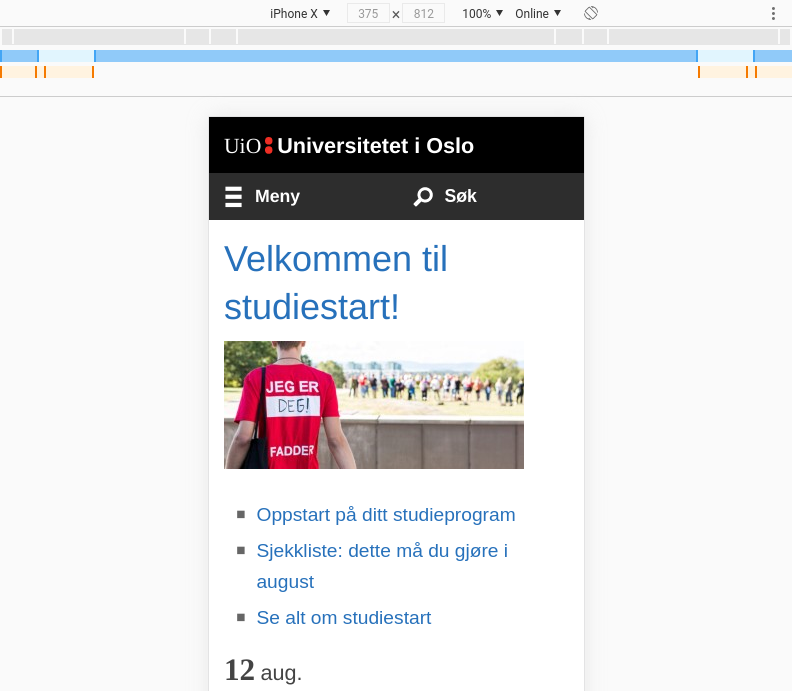
All major desktop web browsers have built-in tools where we can test how web sites look and behave with different device sizes in a simulated environment.
Chrome calls their device simulation tool Device toolbar while
Firefox calls it Responsive design mode. Either way, we just have to
look for a symbol of a mobile in our web development tools, or hit the
universal keyboard shortcut Ctrl+Shift+M. Here we can select the
device we want to simulate, the orientation of the screen, throttle
our network connection and much more.
We recommend spending some time playing with this tool and getting familiar with it.