Mandatory Assignment 1
Part one (HTML and CSS)
In this initial assignment, we will be working with HTML and CSS to create a responsive web page that fits all screen sizes.
If you have limited experience with HTML and CSS, we recommend reading the HTML5 Style Guide and Coding Conventions before you proceed.
Step 1: HTML structure
Create a .html document with the standard HTML-structure (<html>,
<head>, <body> etc.). Set up a basic structure following HTML5
semantics
that includes a header-element to contain a menu with links to
relevant pages and a picture of you. Further, the page should include
a section that present projects that you have been part of in a list,
and/or similar sections with work experience, and courses and
educational institutions attended. One section presenting one of the
examples above is sufficient. You may use the template to structure your
HTML file:
<!doctype html><html lang="en"><head><meta charset="utf-8"><meta name="viewport" content="width=device-width, initial-scale=1.0"><title>Original title</title></head><body></body></html>
Other relevant resources
Step 2: CSS
Create a .css file and link to it in your HTML-document. Add styles to the different components of the page, so that its design resembles (something like) the layout illustrated in the figure below.
Relevant Resources
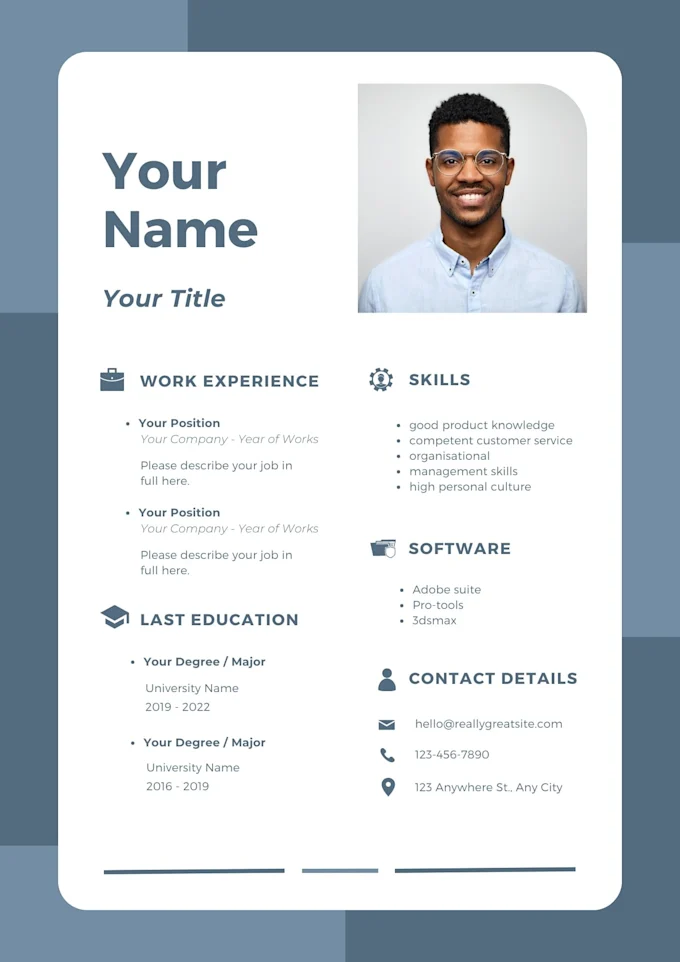
Step 3: Responsive design
Make sure that your design automatically fits all screen sizes. For instance, the number of projects displayed horizontally should automatically adjust to the width of the screen. This can be tested in most desktop browsers with the Device Mode tool.
Relevant Resources