DHIS2
Adding a DHIS2 UI button to an app
Button API
When using components from external libraries, it can be very helpful
to first read the documentation to find out which properties the
component expects and what those properties do. @dhis2/ui has a
large exported interface with many components which is why we are
going to look at the documentation before using the Button component
in our app.
DHIS2 UI documentation
@dhis2/ui's documentation has a getting
started guide, API reference and live demonstrations of the
various components.
For now, we are interested in the Button component's API.
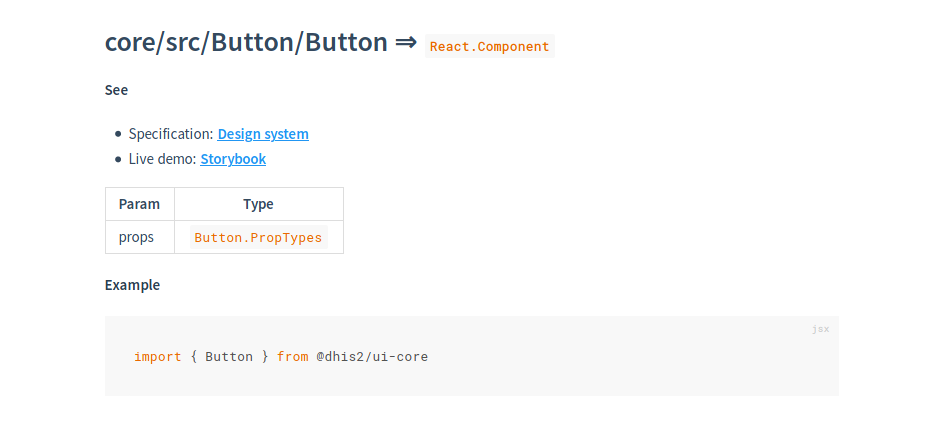
This section tells us where to find the design specification, where to
find a live demo as well as how to import the the Button
component. We can see that the Button takes Button.PropTypes as
component properties. We can find the definition of this property set
on the same page right below the current section.
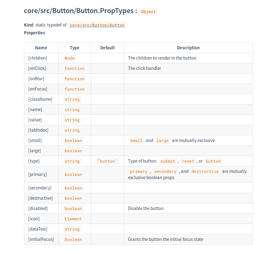
Commonly used properties
- onClick: the function called when the button is clicked
- type: the type of the button
- set to
submitwhen used as a form submission button
- set to
- primary/secondary/destructive: button style
- primary: used to highlight the most important/main action on a page
- secondary: used for passive actions, often as an alternative to the primary action
- destructive: used instead of a primary button when the main action is destructive in nature